The Crucible (1953) is Arthur Miller’s harrowing play about the 1692 Salem witch trials. Set in the strict moral confines of a righteous, patriarchal, Puritan theocracy, The Crucible examines what happens to individuals who refuse to conform to social norms in an atmosphere of mass hysteria. Set designer Andrew R. Cohen discusses his work on this timely play at the Olney Theatre Center–a production which The Washington Post recently called “a blazing revival.”
Michael Schweikardt: Tell me about designing the set for The Crucible for Olney Theatre Center.
Andrew Cohen: The Crucible is one of my favorite plays. It may be one of the first plays I ever read when I was in middle school, well before I had any notion of set design. The thing about The Crucible that has always stuck with me is the feeling I get when I read it; there is this noticeable pounding in my chest. It’s like living in a fever dream, terrible and claustrophobic. It is so scary to think that these events actually happened.
MS: Where did you start?
AC: One of the ways I approach a design for a play is to decide what kind of space or environment is best suited to the storytelling–Emotional, Intellectual, or Psychological. An emotional space would appeal to the mood or feeling of a play.
An intellectual space would comment on the play in some way that causes the audience to think. A psychological space would mirror the mental and emotional mindset of play (the Psychological is sometimes the intersection between the Emotional and the Intellectual).
Emotionally, The Crucible is a play that is mostly somber in tone with peaks of pandemonium and chaos. Intellectually, Miller wrote the play as a comment on McCarthyism. Psychologically, the play is seen through the lens of the mindset of the townspeople. Their group hysteria gives the whole play a sense of dread and encroaching doom as if a nightmare were truly manifested. The play has an end of times feel to it. Ultimately, this is what guided the way I approached the design for the play. Based on my multiple past collaborations with Director Eleanor Holdridge, I knew that all the ingredients were there to make a poetic, psychological design.
MS: Who are your collaborators?
AC: Along with Director Eleanor Holdridge, the rest of the creative team consists of Costume designer Sarah Cubbage, Lighting Designer Nancy Schertler, sound designer Patrick Calhoun, and me.
What I loved about my collaborators, besides being brilliant artists, is that they each provided a unique point of view on this story that I could not. I’ve always been a good listener and I absolutely want to hear what everyone has to say. I don’t have all the answers. That’s what I love about theater; a group of people can come together, talk about the play from many different perspectives, and develop a cohesive, collective narrative and aesthetic for a play.
MS: Have current events shaped how you experience the play?
AC: We started our talks back in October of 2017 and midway through our process the #metoo movement threw all of us a bit of a curveball, artistically speaking. It made us question how we see the play and how we view the character of John Proctor, our noble “hero.”
About the time of our second design meeting, the #metoo movement really started erupting. I think it was Nancy [Schertler, lighting designer] who made a joke about #Abigailmetoo. We all nervously laughed but knew we had to talk about it.
Consensual or not, The Crucible tells a story of an older man abusing his power over a younger servant. In the past, I had always viewed John as the righteous hero, and Abigail as the slandering maker of chaos. But my thoughts about Abagail have certainly changed, and the way I view John has certainly changed as well. I understand Abigail’s motives a lot more; I feel for her, whether she truly loves John, or feels she was used and abused, or both. I understand her more now than I had in past. And when I see John I am less on his side from the beginning; it’s now all a lot grayer.
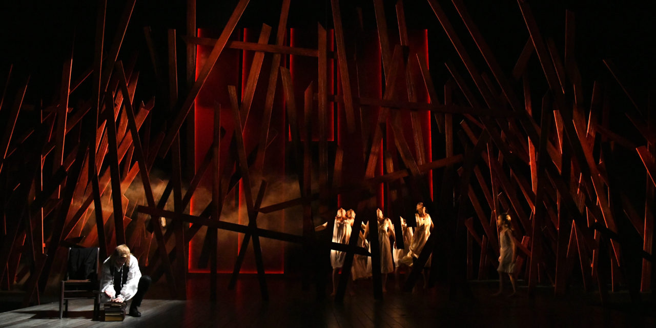
MS: The woods seem to have a constant presence throughout your design.
AC: One of the things that interested Eleanor was the relationship of Salem to the surrounding woods (both physically and metaphorically). In most of our conversations, we would keep coming back to the presence of the woods–to the idea that outside of Salem there were only woods for hundreds of miles. To wander out of town basically meant death. The woods, in our story, is a place where danger resides.
The play begins after Parris finds the girls of the town dancing out in the woods.
Back then, dancing was prohibited. Girls were expected to remain silent unless asked to respond. They worked and they went to church, and they were most likely married off at a young age. Dancing in the woods is a liberation from the confines of their society.
In The Crucible, we are only told of what Parris saw in the woods. We can register his horror (and his arousal) but we don’t get to see what he saw. The dancing was something that Eleanor, Sarah Cubbage (Costume Designer), and I decided that we wanted to depict as a kind of prologue to the beginning of the play–it’s in complete opposition to the rest of the reserved nature of the play and presents an energy we don’t see again until the Courtroom Scene. The imagery is part supernatural, part sexual, part freedom, part chaos. It is debauchery. It is everything that is in opposition to the rigid structure of their society. Staging it provides a new opportunity to see the girls in an unrestricted state of being.
It’s interesting that the first scene of the play starts out with the fear that the devil has gripped Parris’ daughter, but it quickly devolves into petty grievances and finger-pointing. All of this buried rage and resentment between the townsfolk gets revealed and leads to mass paranoia and an atmosphere where reason is disregarded. The woods become a container for so many things–evil, danger, resentment, sexuality, liberation, infidelity, mysticism–the list goes on and on.
They needed to always have a presence.
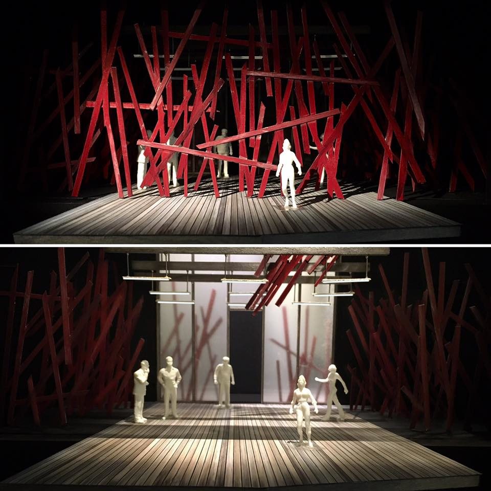
The Crucible–Model photos by Andrew R. Cohen
MS: Your set feels like two eras mashed seamlessly into one; it feels very much like Puritan Salem, but in many ways, it’s also quite contemporary.
AC: As the story progresses the set becomes more stylized and anachronistic, basically following the emotional arc of the chaos of the townspeople. It begins feeling Puritan and it ends feeling much more contemporary.
There is always some mix of contemporary and period in each of the scenes but as the story progresses the contemporary elements get more blatantly obvious. It isn’t until the courtroom scene that we get really extreme in terms of the use of contemporary elements and abstract gestures. I’ve always felt that this scene is the turning point in the script. Proctor and Hale (the voices of reason) are almost entirely drowned out in this scene. It is the peak of mass chaos and so I used it to mark our spin into this stylized world of towering glass walls and hanging fluorescent lights. The look of the courtroom scene then informed all the others; from this look, we knew that earlier scenes should look more Puritan and realistic and later scenes should look more stylized and contemporary. The world is not what you once knew it to be.
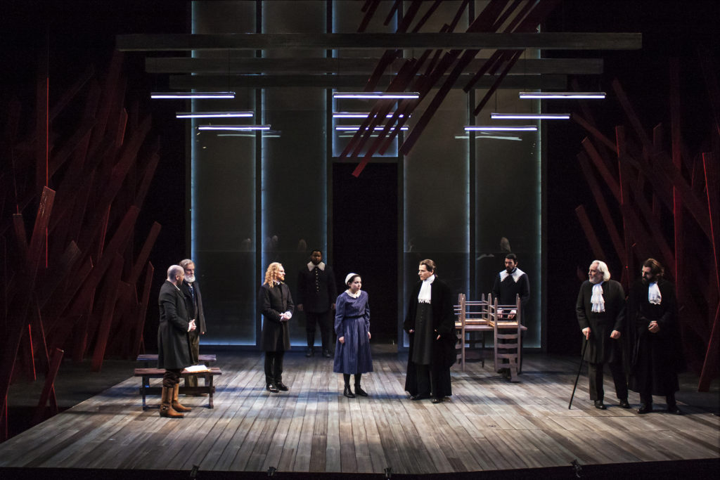
Photo by Andrew R. Cohen
MS: I love how the woods seem to have come crashing through the ceiling.
AC: The idea is that this is the first time that the chaos has pierced through their interior lives. Up and until now, chaos has been looming on the outside.
MS: It is a beautifully bold use of red.
AC: Red carries a lot of meaning: passion, love, rage, violence, anger, restlessness, desire, danger, wrath, longing and lust–Red blood–Red devil–Red hot anger–Red hot love. It certainly is a vibrant color that means a lot, and all of those meanings are embedded in the script. And then there is the Red Scare, as in McCarthyism and, dare I say, Republican red? At the time I was designing, most of these meanings and feelings were “unintentionally intentional,” or subconscious. Visually, the rest of the world of The Crucible is mostly weathered gray wood. The intense red color is the antithesis of the Puritan world; it’s definitely saying something about the growing pressure and chaos.
MS: Arguably, a lot of productions of The Crucible actually depict in some manner John Proctor’s hanging as the final image.
AC: Eleanor and I talked a lot about the final image for this production and we don’t think that the end of this play is about John Proctor’s hanging; we feel that it is about Proctor and Elizabeth. That final scene between Elizabeth and Proctor is about Proctor finally making amends; he admits his flaws, chooses to stop perpetuating lies, asks forgiveness from Elizabeth, and finds the ability to forgive himself. He accepts his fate and this is a huge moment. It’s the most honest and vulnerable moment that we get to see between John and Elizabeth. In many ways, this conversation is harder for John than the prospect of death.
Seeing the hanging would offer finality, but it also undercuts the powerful emotional moment right before it, which I find vastly more fascinating and more poignant. Often we feel the need to wrap a story up in a nice, neat little bow but what interests me more and more as a human and as an artist is the messiness of life. The clean ending isn’t always the most interesting one. The resolution with the vague ending is the one that is intriguing to me; it allows the viewer to digest and interpret.
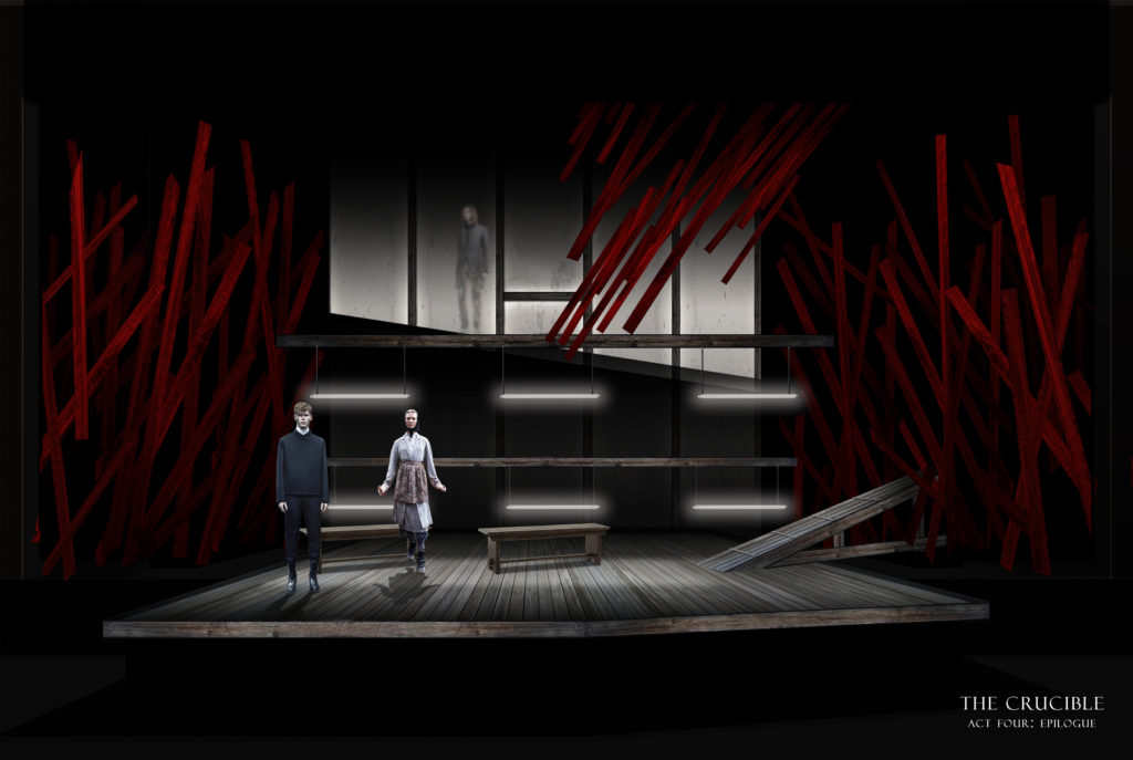
Rendering by Andrew R. Cohen.
Our final look is the image of John Proctor, separated and diffused through the glass, walking to his accepted fate while Hale begs a stoic Elizabeth to make him change his mind. It leaves you wondering.
Andrew R. Cohen is a freelance set designer based in the Washington, D.C. area. His credits include Murder Ballad (Helen Hayes Award Nomination for Outstanding Scenic Design) at Studio Theatre, A Year with Frog and Toad for Imagination Stage, Satchmo at the Waldorf for Mosaic Theatre Company of DC, and Broken Glass at Theater J. His set design for The Crucible can be seen onstage at Olney Theatre Center through May 20, 2018. https://www.andrewcohendesigns.com/
This post was written by the author in their personal capacity.The opinions expressed in this article are the author’s own and do not reflect the view of The Theatre Times, their staff or collaborators.
This post was written by Michael Schweikardt.
The views expressed here belong to the author and do not necessarily reflect our views and opinions.


")