“That’s what we as lighting designers do – we observe, interpret, and find ways to recreate an emotional response without directly telling an audience how to feel.”
Before he designed the explosive lighting used for one of Broadway’s biggest blockbusters, Dear Evan Hansen, designer Japhy Wiedeman created the haunting, macabre and beautiful world for the 2015 Broadway production of The Visit.
The show (originally based on the play by Friedrich Dürrenmatt) tells the story of Claire Zachanassian, the richest woman in the world, who comes back to her hometown of Braken which has fallen into extreme poverty and despair. She offers the destitute townsfolk of Braken ten billion marks on the condition that they unanimously agree to kill her former lover, Anton, the man who did her wrong many years ago.
The Visit had its Broadway premiere in the spring of 2015 and was led by a cast and creative team of Broadway royalty: music and lyrics by the legendary songwriting team of John Kander and Fred Ebb, a book by the late Terrance McNally, John Doyle directed a company lead by Chita Rivera and Roger Rees, and beloved choreographer Graciela Danielle staged the numbers.
I recently had the great privilege to talk with Mr. Weideman about his designs for this unique Broadway event from his mountain home in Asheville, North Carolina.
Colden Lamb: How did you acquire the job for The Visit?
Japhy Weideman: I was hired by director John Doyle to do the piece. I believe he saw one of my other previous works prior to hiring me.
CL: The Visit was your first big Broadway musical you had the opportunity to design, is that correct?
JW: Yes it was. Shortly after I worked on The Visit at Williamstown (the location where we had our out of town tryouts for this production) in the summer of 2014, I began to work on the out-of-town tryouts for the bluegrass musical Bright Star at The Old Globe [San Diego] later that Fall. However, I would say that The Visit is not a conventional “big Broadway musical” in comparison to song and dance musicals like Guys and Dolls or 42nd Street.
CL: How did you go about designing the show? What inspired you to bring out the macabre, Cabinet of Dr. Calgari-esque mood of the musical?
JW: I strive, whenever I design a project, to not fit into one certain mold, therefore I tried to have a lot of different influences in the lighting design for this musical, in particular a German-influenced style of lighting. When I was younger, I worked as an associate for an opera lighting designer named Duane Schuler. It was in this collaboration I began to see how to utilize muscular, bold, single, bright white light sources in lighting design. When I started working on The Visit, it was easy for me to apply that style to this dark European story. The show had a really strong source style to it — the audience could always feel the directionality of the light. I don’t know if I’ve ever worked on a project with exactly that kind of aesthetic. It was very enjoyable.
CL: What was the relationship between your lighting design and the set design by Scott Pask?
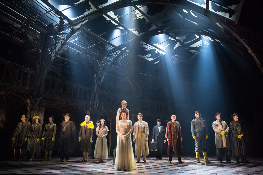
JW: Scott Pask did this incredible forced-perspective set which resembled a dilapidated, long-abandoned train station with nature taking over the wrought iron structure. It was a unit set so it gave me, as a designer, an opportunity to create various angles and beams of light coming through and above it.
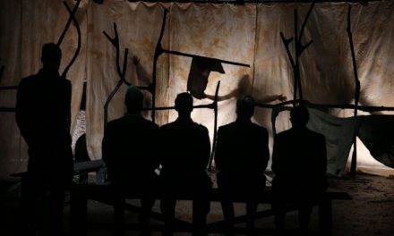
The Visit had a lot of shadow play. For example, the shadows that were illuminated on the back wall or from the footlights during certain scenes, in particular, any of the duets in the show, helped resemble the spirits of Claire and Anton, the eternal part of those characters that would live on.
The color of the set in addition to the way the train station was designed worked really well, giving me so many possibilities to work with such as being able to lay out the lighting plan in a very flexible way, where I could get any kind of light quality or any angle I wanted. I had a series of moving lights placed in side positions, all around and above. You could turn any one of those lights on, shoot it through the set and it was magic. Many scenes in the show were lit from only one or two sources and that was it. Because of this, the architecture of the light itself started to have a language of its own that became emotional storytelling, it all unfolded in a very natural way.
CL: Did you use any gobos (a metal sheet in front of a light fixture that creates shapes and figures) for the set or did the broken glass from the arches of the set act as natural gobos?
JW: There were no gobos. We used the arches in order to create natural shadows. You see this style of lighting more often used in Germany. For example, instead of simulating shadows or beams, we preferred to put light through the set, and in return, the set made the best shadows you could ever want. It very much resembled the famous pictures of Grand Central Station with the strong beams of light coming through all the windows. Furthermore, we used a good bit of haze in the show to help show off these beams of light to have a haunting, ethereal quality. At times, that quality could feel very holy and divine while other times it could feel piercing, evil, and foreboding.

“Look At Me.” Chita Rivera, Mary Beth Peil, and the company of The Visit. Photo by Sarah Krulwich and Japhy Weideman. Photo permission by Japhy Weideman.
CL: What was your working relationship like with director John Doyle?
JW: During the tech rehearsals, John and I would do these morning sessions before the actors arrived at the rehearsal where we would sit together and work through the script in order to create a starting idea of what the atmosphere for each of the scenes was going to be. These morning sessions would give us time to collaborate with each other before John began working with the actors and I went off to work on the light cues. John always encouraged simple choices that were very bold, or an emotional thematic choice to light a scene.
John is also a theatrical designer. Although he didn’t design The Visit, John does design sets for some of his shows, therefore he has strong feelings about lighting – what it can do, and what is possible.
With some directors, every time something changes on the stage, they want a different light cue, or to follow the actor around with lights so they are evenly lit all the time. John really understands that you set up an architecture of how a scene looks. For example, if it’s dark in the downstage left corner and an actor wanders to that position, John is perfectly happy for the actor to deliver information in shadow. I think it’s quite effective and works very well. He is the kind of director who never tells his lighting crew, “Turn that light on ” or “Make it this color”, which is an approach I prefer.
CL: Terrence McNally’s script has the scenes bleed from one to the next cinematically. The majority of the time, neither the script nor John Doyle’s staging communicated to the audience where exactly the characters were meant to be. Some scenes are in limbo. Therefore, it was really up to your lighting to communicate to the audience the time and place within the story. How did you overcome that challenge?
JW: I’m sure I did have some challenges with that when I was working on the piece. However, the combination of Kander and Ebb’s musical score and the way John Doyle created the entrances, the exits, and the grouping of the scenes, created a framework and a guide for knowing where the changes were going to be. Now in terms of tying all those things together, it was more intuitive — the lighting would just start filling in the gaps, if you will. When the time came for the scene to change, it would just reveal itself. A majority of the time, that’s simply the way lighting is, it just appears out of thin air.
CL: One of the thematic colors used in The Visit is yellow, the color that represents avarice and greed in the show. Was it difficult to light the color yellow on the stage without it becoming too orange or too green?
JW: Sometimes it is, depending on the pigment of the set. I don’t use a lot of yellow when I design shows, but with The Visit — in particular the musical number “Yellow Shoes” — it worked really well. The costumes designed by Ann Hould-Ward were very monochromatic. When color was introduced, the yellow shoes for example, really popped. I used different techniques in my lighting to make the shoes look really yellow from multiple sources. I would just light their feet so it came across to the audience as if all they could see were these yellow shoes in space. It was a lot of fun and we got a lot of great joy out of that particular number.

“Finale”. The company of The Visit. Photo by Sarah Krulwich and Japhy Weideman. Photo permission by Japhy Weideman.
CL: In the show, you favored harsh bright white lights coming off stage left and right and down center. Was this to reflect the Brechtian epic theater technique of using harsh white light to illuminate the truth?
JW: In some ways, it was, however, I wouldn’t pigeonhole it as one thing, that’s just one aspect of that choice. There are other aspects of that quality of light. With those lights, I was able to shift the temperature to make a scene feel very warm and golden, sunbeams if you will, as well as feel cold and harsh in another scene. It had a quality that was constantly evolving.
CL: So you wouldn’t categorize either your use of footlights as Brechtian in order to communicate the reflection of society?
JW: Correct, it was just another aspect of that choice and it was able to serve multiple purposes. For example, I also used the uplighting on the cast who played the townsfolk of Braken to bring out a sinister feel and bring out weird strange shadows. The difference between my lighting style and Brecht’s lighting style was the fact that Brecht wanted you to see all the lighting instruments. Brecht wanted his audience to see what the theater techniques that were creating the world of the story. With The Visit, all the lights were masked which gave it a very special quality and made the lighting feel like somehow they were coming within or above the train station.
CL: The Visit had a cast and creative team of theatrical royalty; John Kander, Terrence McNally, John Doyle, Ann Hould-Ward, Graciela Danielle, Chita Rivera, Roger Rees, the list goes on. Do you have any fond memories of collaborating with these Broadway titans?
JW: At that point in my career, it was my fourth Broadway show, to be in a room with those legends and to be sharing that experience was incredible. It was otherworldly to be facilitating and visually interpreting with light everything that transpired on that stage. It will go down in memory as being of the great theatrical experiences of my life. I’ve had many others but that’s a very special one. It was very much a Theater-Hall-of-Fame-type of experience.
CL: How did it feel to be Tony-nominated for this show?
JW: Oh, it felt lovely. I was very grateful especially since I was nominated for two Tony Awards that year – the other was for Airline Highway — which was very exciting. It’s always kind of a surprise.
CL: Do you have a favorite lighting moment in the show?
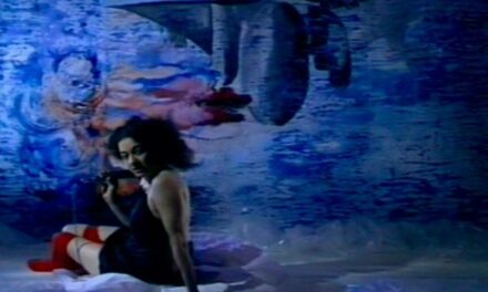
JW: A sequence that stands out to me is the musical number, “Love and Love Alone”, a ballet between Chita Rivera’s character and her younger self, where the stage transformed into this deep, deep indigo. It was the one time in the piece I used a lot of colors because it represented the fantasy of days gone by. The two lovers, Anton and Claire, had the opportunity to be together a long time ago but now their lives have passed. The two were not going to be in a living plane of reality much longer, they were going to go on, transcend and leave their bodies in a short amount of time. “Love and Love Alone” was a moment of remembering what youth was like and what love was like at a young age. It was kind of a dream state, a heightened state, a place of love.

“Love and Love Alone”. Chita Rivera, Michelle Veintimilla, Roger Rees and John Riddle in The Visit. Photo by Sarah Krulwich and Japhy Weideman. Photo permission by Japhy Weideman.
CL: Was there anything from lighting The Visit that aided you when designing your other musicals down the road such as your biggest hit, Dear Evan Hansen?
JW: Although Dear Evan Hansen is a very different show entirely, there are moments in that show that apply to The Visit. That being said, in all of the shows that I work on, I try really hard to not fit in one certain mold. If designers have a show that is really successful, other people or critics make the assumption that is the singular style of that particular designer. Actors can get pigeonholed in the same way, but it’s not necessarily true.
CL: Of course, Dear Evan Hansen is more a rock concert while The Visit is more of a German expressionist piece.
JW: Correct. In Dear Evan Hansen, the pigment of the world is black with video screens where people and furniture pieces move in space. If I was going to draw any similarities between the two shows it would be my implementation of piercing strong white sources. I like the idea of creating heightened energy that is ethereal as if there’s a higher consciousness at work that is bigger than all the characters. Although no audience member sitting there is going to think of it that way, it’s an essence that you feel. That’s what we as lighting designers strive to do, we observe, interpret, and find ways to recreate an emotional response without directly telling an audience how to feel. There are universal qualities that everybody connects with in some similar ways. It’s ineffable. You can feel it, and can you feel it when it’s right or when it’s not right. Furthermore, you can feel it when it connects to music and the story when it glues everything together in a way that helps elevate a theatrical experience.

Japhy Weideman
Japhy Weideman, is a New York-based designer that creates lighting environments for theater, opera, and other live events. His designs have been presented extensively throughout the United States, Europe, and Asia. Broadway credits include: Dear Evan Hansen, Charlie and the Chocolate Factory, Significant Other, Bright Star, The Nance, Of Mice and Men, The Heidi Chronicles, Macbeth, Old Times, Sylvia, The Snow Geese, Marvin’s Room, Cyrano de Bergerac, Airline Highway, and The Visit. Off-Broadway work includes Lincoln Center Theatre, Roundabout Theatre Co, New York Theatre Workshop, The Public Theater, LAByrinth Theatre Company, Playwrights Horizons, Second Stage, Primary Stages, NY City Center, Juilliard Opera Center, Manhattan School of Music, Ma-Yi Theatre Co, and Soho Rep. Dance includes Chase Brock Experience and Tami Stronach. Internationally, Japhy has designed on The West End-London, The Royal Shakespeare Company, Teatro alla Scala, The Nederlandse Opera, The Edinburgh International Festival, Opera de Lyon, The National Theater of Greece, and The National Theatre of Korea. He has also worked on productions in Tokyo, New Israeli Opera, Theater an der Wien, Theater del Liceu, Festspielhaus, and Saito Kinen Festival. U.S Regional Theatre credits include American Conservatory Theatre, Alley Theatre, Arena Stage, Berkeley Repertory Theatre, Berkshire Theatre Group, Cincinnati Playhouse, Cleveland Playhouse, Huntington Theatre, La Jolla Playhouse, Kansas City Rep, Kansas City Opera, Arkansas Rep, Minnesota Opera, The Old Globe, Oregon Shakespeare Festival, San Jose Rep, Santa Fe Opera, Signature Theatre, Westport Playhouse, and Williamstown Theatre Festival. Originally from Asheville, North Carolina, Japhy studied lighting design at The University of New Mexico in Albuquerque under his mentor John Malolepsy. japhyweideman.com
Colden Lamb is a Southern California actor. He is also a graduate of San Diego State University.
This post was written by the author in their personal capacity.The opinions expressed in this article are the author’s own and do not reflect the view of The Theatre Times, their staff or collaborators.
This post was written by Colden Lamb.
The views expressed here belong to the author and do not necessarily reflect our views and opinions.